

Exploratory Data Analysis is a statistical approach used to summarize and understand the main characteristics of a dataset, primarily through the use of visual graphics and data visualization methods.
Individuals in statistics or data science read this material when comparing initial data investigation techniques against formal hypothesis testing procedures.
External context
For someone working on their own pages, understanding EDA means recognizing it as an open-ended process designed to let the data guide the discovery of patterns and potential hypotheses. This contrasts with traditional methods that require selecting a model before examining the data. Furthermore, while EDA includes initial data analysis (IDA), it is broader, focusing less narrowly on just checking assumptions or handling missing values for specific models.
Exploratory data analysis Wikipedia contributors, “Exploratory data analysis”, en.wikipedia.orgLicence01What it is and how it works
EDA involves using statistical summaries, visualizations, and simple tests to gain insights from data without a specific hypothesis. Think of it as looking at the raw ingredients before you start cooking. You are not testing if 'Brand X' performs better than 'Brand Y'; instead, you might plot all brand mentions over time to see if there is a cyclical pattern or an unusual spike that warrants further investigation.
Mechanistically, EDA relies heavily on data reduction and visualization. For instance, if your dataset contains millions of search queries, simply looking at the raw text is impossible. You use techniques like calculating frequency distributions (e.g., how often does 'best' appear?), generating histograms (to see the spread of query lengths), or creating scatter plots (to check for relationships between two variables, such as query length and click-through rate). The goal is to transform a massive, complex dataset into manageable visual patterns that suggest where you should focus your hypothesis testing efforts later.
Exploratory Data Analysis (EDA) means looking closely at your raw brand appearance data—like search queries or featured snippets—just to see what patterns exist. You are not trying to prove a theory yet; you are just trying to understand the landscape first.
02What to do about it
When reviewing AI search data this week, focus on these concrete actions. First, segment your data by failure points. Instead of looking at overall brand visibility, filter the dataset specifically for queries where your brand was mentioned but did not appear in the top three results. This isolates potential gaps.
Second, look for unexpected correlations between query modifiers and visibility. For example, does adding 'review' or 'alternative' to a core product search significantly reduce your average ranking position? Grouping these negative modifiers helps you understand user intent shifts that might be missed by simple volume tracking.
Third, perform outlier detection on performance metrics. If one specific geographic region shows unusually high brand mention rates but low click-throughs, this suggests a content mismatch or localized technical issue that requires immediate attention before scaling any strategy.
03How it is measured or noticed
You notice EDA results through visual anomalies and statistical summaries. Key metrics to observe include:
Skewness: If the distribution of your brand's average ranking position is heavily skewed (e.g., most results are high, but a few massive dips pull the average down), it signals that outliers are dramatically affecting your perceived performance. Outliers: These are data points that fall far outside the expected range. In search data, an outlier might be a sudden, unexplained drop in brand mentions for a historically stable keyword set. This requires immediate manual investigation to rule out tracking errors or algorithm changes. Correlation Heatmaps:* By mapping variables (like query length vs. featured snippet capture rate), you can visually spot strong positive or negative relationships that need explanation. A high correlation suggests a reliable pattern, but it does not prove causation.
How the record puts it
In statistics, exploratory data analysis (EDA) or exploratory analytics is an approach of analyzing data sets to summarize their main characteristics, often using statistical graphics and other data visualization methods.
04Common mistakes to avoid
When performing EDA on search data, marketers often make assumptions that lead to incorrect conclusions. Use these warnings to guide your analysis.
05When EDA does not apply (or what it confuses with)
EDA is a powerful diagnostic tool, but it has boundaries. It is descriptive—it tells you what happened or what the data looks like, but it cannot tell you why unless you have external context. It should not be confused with formal hypothesis testing (like A/B testing), which requires a specific, testable prediction and controlled variables to prove cause-and-effect. Furthermore, EDA is limited by the scope of your collected data; if your tracking system fails to capture certain types of AI search interactions, no amount of analysis can recover that missing information.
06A worked example
Imagine you analyze raw search logs and notice that for queries containing the phrase 'vs [Competitor]', your brand's average ranking position is consistently 12, while competitors cluster around 3. This pattern is immediately visible through a simple box plot.
The visualization clearly shows that the median rank for 'vs [Competitor]' queries is significantly higher than industry benchmarks, indicating a systemic ranking gap rather than random fluctuation.
The entry above is written by GetLoopLoop. What follows is what independent catalogues hold about the same term — none of it is the source of this page.
- Also called
- EDA
- Part of
- statistical data interpretation
- Kind of thing
- field of study, field of study
The same term on Wikipedia
Catalogued in 17 languages07Frequently asked questions
How does running an exploratory analysis differ from performing a standard A/B test or hypothesis test on our brand data?
It differs because you are not testing a specific prediction; instead, you are surveying the landscape to generate potential hypotheses. Standard testing requires you to assume a relationship (e.g., 'changing X will increase Y'), while EDA allows you to discover unknown relationships or anomalies first. You use it when you don't know what questions to ask yet.
If we have extremely high volumes of raw AI search data, is an exploratory analysis still useful, or do I need advanced machine learning tools?
Yes, EDA remains incredibly valuable even with massive datasets because it focuses on identifying patterns and outliers that simple aggregations might miss. While advanced tools can process the volume, EDA provides the necessary human-interpretable summaries—like visualizing distribution shifts or unusual clusters—to guide those complex models.
What specific types of visualizations are most effective when trying to understand how our brand is framed in AI search results?
Heatmaps and network graphs are particularly insightful because they visualize relationships between concepts, rather than just single keywords. Scatter plots that map ranking position against query length or time of day can also reveal non-obvious structural patterns in the data.
I've run an EDA and found several anomalies, but I don't know if they are real issues or just noise. How do I validate my findings?
You must cross-reference your statistical findings with qualitative context, such as known product launches, competitor campaigns, or recent site changes. If the anomaly appears statistically significant but lacks a plausible external cause, it may be data noise and should not trigger immediate action.
Is EDA only useful for analyzing raw search logs, or can I apply this methodology to structured performance metrics as well?
You can apply the principles of EDA to any dataset, including structured performance reports. However, its true power comes from unstructured data—the raw logs and outputs—because it allows you to look at the context surrounding the metric, not just the final number.
Wikimedia Commons
Related visuals with source and licence credit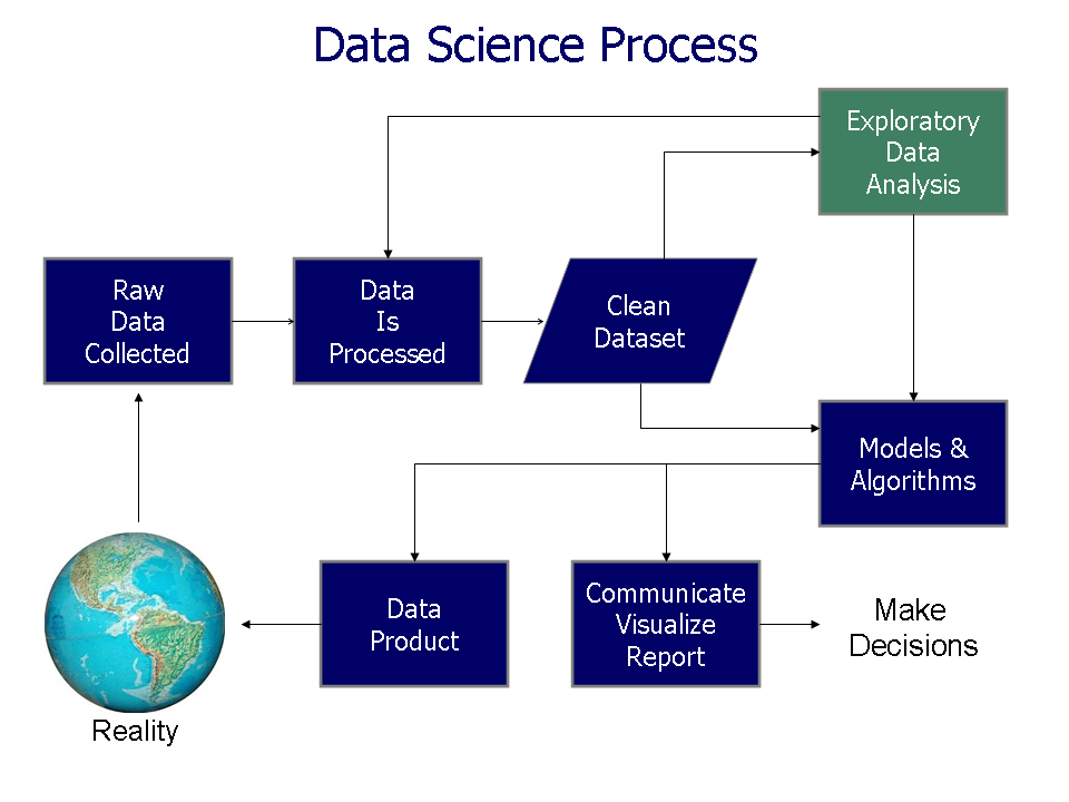

08Asked out loud
The same term in the words somebody uses speaking to an assistant rather than typing into a box — written from the situation, which is why each one carries the situation it came from.
You should begin by generating statistical summaries and creating basic visualizations to get a high-level overview of the data structure. This initial sweep helps reveal unusual distributions or clusters of related terms that you might not have thought to search for manually.
You should quickly look for visual anomalies, paying close attention to sudden shifts in common phrases or unexpected groupings of competitor names. This rapid diagnostic check helps you flag potential issues immediately without needing a deep dive into specific hypotheses.
You can begin by running an initial investigation to summarize the data’s main characteristics, focusing on visualizing key metrics like query volume and ranking distribution. This process allows you to discover underlying patterns or structural issues without needing a predefined question.